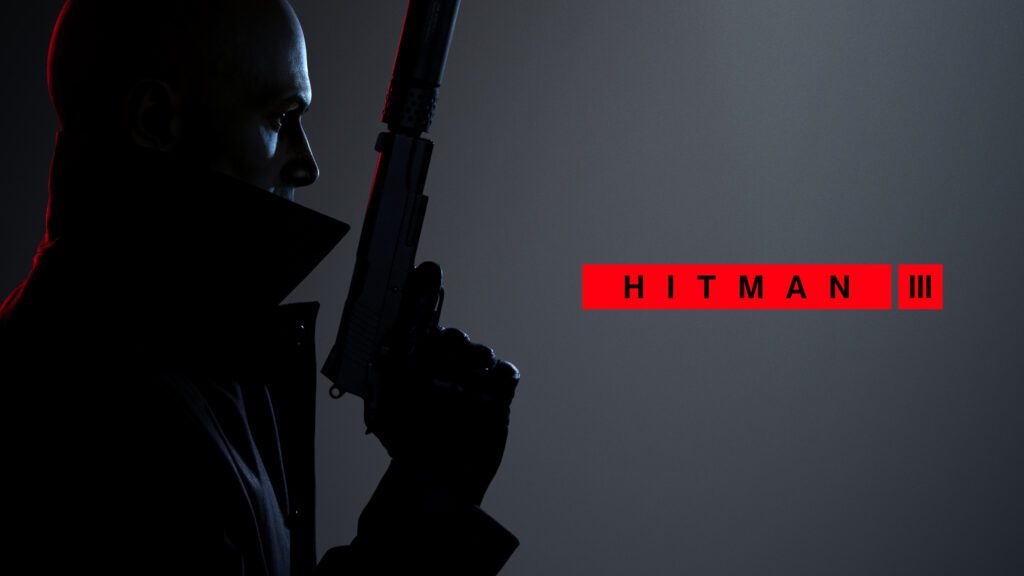
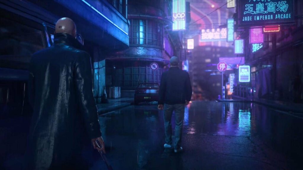
Hitman 3 is probably one of the best titles in the long-standing series of stealth and espionage. It’s a pretty game but its visuals aren’t just for show. It’s a game that has been clearly designed to be easy to understand visually.
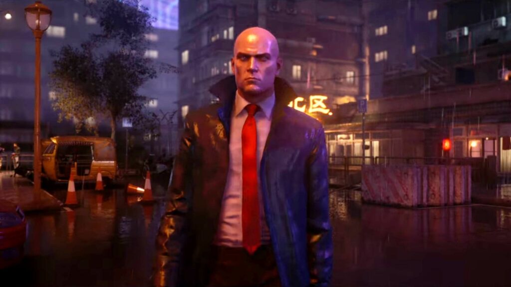
The devs have clearly made an effort to make this game a genuinely comfortable game to look at, despite its darker color tones. However, we don’t all have the same living experience. Inevitably, many of us need to further adjust our games in order to fully enjoy them.
If you’ve been looking for the best Hitman 3 settings for visibility, we’ve got you covered.
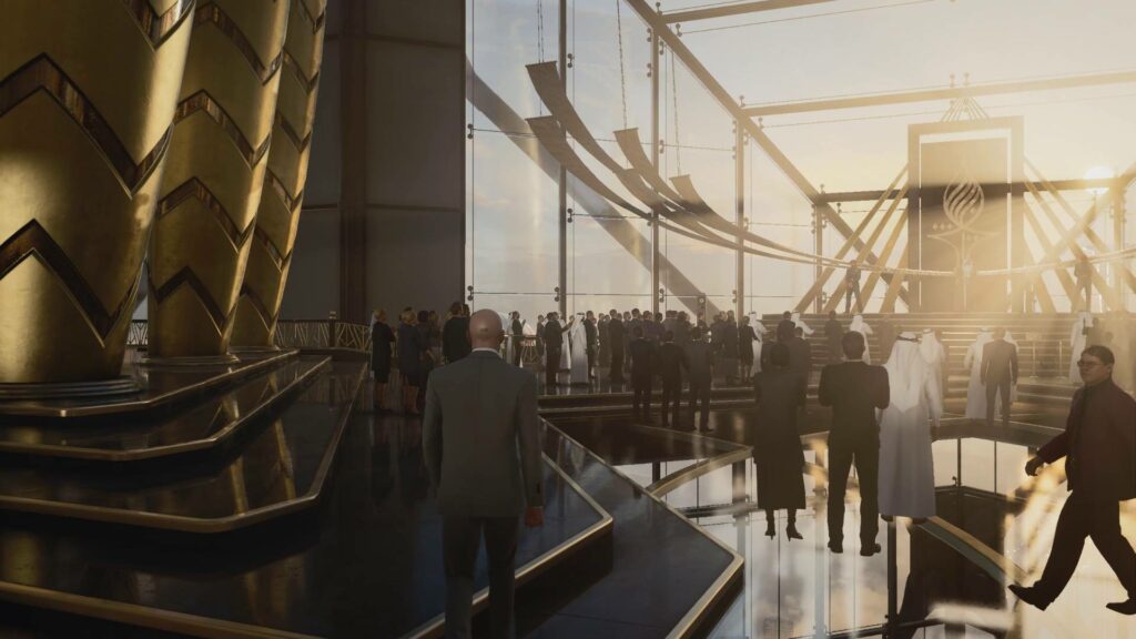
Why Adjust Your Hitman 3 Visibility Settings?
Adjusting your visibility settings in Hitman 3 can yield a variety of benefits. The most obvious one is accessibility. If you’re visually impaired or have trouble seeing elements of a screen, you can improve your enjoyment of the game by adjusting certain settings.
Another important factor is game comfort. Even for people who, by definition, aren’t visually challenged, certain games may feel less comfortable than others due to a number of factors. One could be screen proximity. If you’re playing from your couch on a TV, small text can be hard to read. Even certain visual cues and UI elements may be harder to distinguish from the rest of the elements of a given scene.
With all of that in mind, here are a few reasons why you may want to look into the visibility settings on offer in Hitman 3:
- You’re visually impaired or have a particular eye condition that reduces your ability to read and understand something on a screen.
- You sit too far away from your screen or TV which makes distinguishing certain graphical elements harder.
- Your monitor or TV is naturally darker or of higher contrast, forcing you to bump up the brightness more than usual for certain games.
Screen Settings
Before delving into more nuanced visibility settings, you need to adjust your Hitman 3 graphics options. In order to get the most comfortable visual experience out of the game, you need to ensure it’s performing well. By performance, we mean frames per second. Assuming you’re playing on PC, you can adjust settings so that the game runs at a buttery smooth 60 fps.
The following settings are based on using an RTX20 series card with a mid-range CPU:
- Level of detail: High
- Texture quality: High
- Texture filter: x16
- SSAO: Medium
- Shadow quality: High
- Mirrors reflection quality: Low
- SSR quality: Medium
- Variable rate shading: Off
- Motion Blur: Off
- Simulation quality: Base
If your hardware is less powerful, you can opt to start making adjustments. Start by lowering Shadow quality, texture quality and level of detail. Use trial and error until you get to the point where you regularly maintain the 60 fps threshold.
Once you’ve adjusted your graphics options, you can move on to making changes to the rest of the visibility settings.
Text Visibility
Hitman 3 has five features that make it a highly readable game. In layman’s terms, this means it’s easy to read or to make the text in the game easier to distinguish and read without squinting or needing to get closer to the screen.
Reader Level
According to several outlets, Hitman 3’s text is considered appropriate for a reading level of a high school student. This isn’t an option you can adjust but it should give you an idea of the number of words and the complexity of sentences that’ll likely appear throughout the game.
Text Size & Contrast
The text in Hitman 3 is considered to be relatively large and clear to read. Letters stand at approximately 46 pixels in size which would be 1/20th of the height of a 1080p screen. This number is primarily true for menus and interface text. You can adjust the size of these fonts via the Interaction Prompt Size options.
Hitman 3’s text contrast is generally quite high. The text of the interface is typically brightly colored, such as white or red, and is surrounded by darker UI elements.
Subtitles
Every spoken word in Hitman 3 is subtitled when you turn them on. This means that even certain characters talking at the same time as your own will have their speech appear in text form on screen most of the time. This can get a bit confusing if you rely on captions to fully grasp what is being said.
Like the menus, subtitles in this game are about 46 pixels in size on their default setting. That makes them quite comfortable to view even from a distance on a 1080p screen. You can also adjust the size of the subtitles by going into the audio menu and tweaking the Subtitle Size option.
Interface & Navigation
In terms of visibility, Hitman 3 has some great elements in its UI and navigation menus that make it easy to understand what you’re seeing. Maps, minimaps, and menus all have special markers that are colorful and bright, so they’re easy to distinguish from the rest of the visual elements and background.
Because the size of the menu text can be adjusted, as mentioned above, it makes the rest of the HUD and interfaces more prominent. The best settings, in this case, will depend on a number of factors, including your screen size, sitting proximity, and personal visual acuity.
PUBG, Fortnite, Whatever-Game fanatic. Food evangelist. Internet ninja. Friendly communicator. Twitter fan. Zombie fanatic.


![[16.01.2024] Leena-Senpai’s Update](https://gamepleton.com/wp-content/uploads/2024/01/image-218x150.png)


